The Beginner’s Guide to Facebook Canvas

Some of the most efficient ads you can buy in 2016 are on Facebook. And the best ads on Facebook today are more than images or videos. They’re experiences.
For a stellar example of this, we’re pretty bullish on Facebook’s Canvas ad product. This unit is driving serious results for its beta test users—it’s worth exploring whether you can make it work for an upcoming campaign.
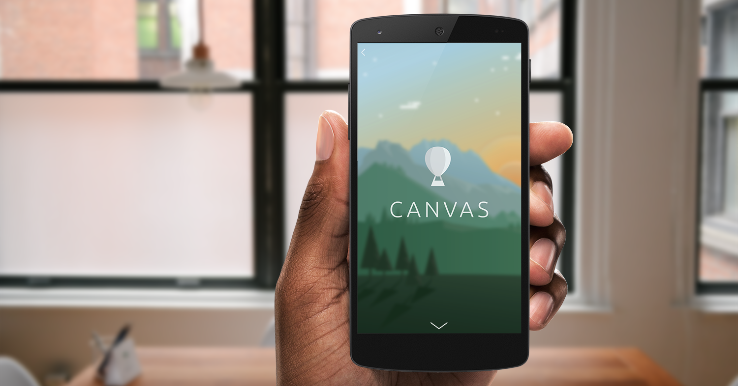
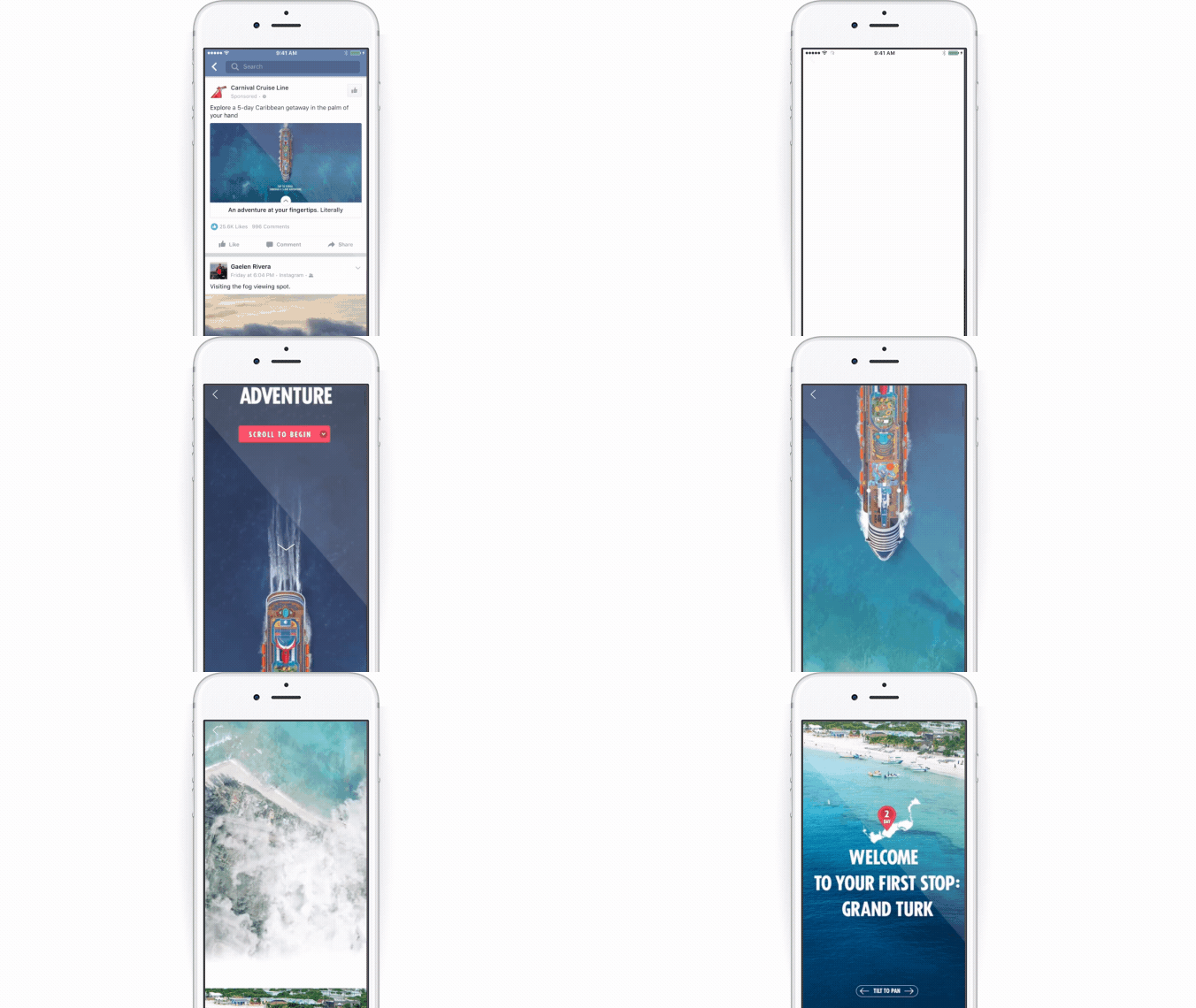
Facebook Canvas is an interactive unit whose components the user controls. Your target consumer enters by tapping a link from her News Feed (and these ads load almost instantaneously—a major perk); the user can then scroll, flip, and even pan across photos and videos you’ve put into the ad unit by moving her phone from side to side. It’s an entirely new way to grab, and keep, attention from users on Facebook (which is to say, everyone and anyone you want to reach).
There’s more good news: Facebook has just made it easier for advertisers to test and implement campaigns using Facebook Canvas, with no minimum ad spend required. The investment required to launch a Canvas ad will be mainly in the design of the content that makes up the experience, although it’s possible to populate one with all existing assets.
So what content can a Facebook Canvas accommodate? This is where it gets really creative and interesting…
The ad experiences are made up of units. You decide how many units, and what types, your Canvas will contain; each is freestanding and you can reorder them however you want before launching the ad.
The unit types currently available are:
Photo/Video: An extremely cool feature of Canvas is the flexibility of the photo and video dimensions, and how the user engages with different sizes of photos. If you upload widescreen photos or videos, users can “explore” the parts of the image that aren’t immediately in view by physically moving their phone around to see more.
Text Block: Space to add any copy you want.
Button: A link-out that takes users to any site you specify.
Carousel: A series of images that users swipe through; each can have a link attached, if desired
Product Set: A selection of products from a catalog that dynamically displays what will drive the highest sales
The most substantial differentiator for Facebook Canvas ads, currently, is far greater time spent than the typical image or even video can command. Early test partners reported dwell time upwards of 30 seconds; in one case, 2 minutes. That’s pretty huge, given that Facebook counts a video ad view at 3 seconds, and many users spend just a split-second taking in your messaging in a typical News Feed post.
The most obvious benefit of more dwell time with an ad is greater ad recall in the long run. One beta tester saw 11% increase in ad recall with Canvas, versus Facebook link ads.
The inclusion of a ‘Product Set’ in the units available for these ads means that Facebook sees Canvas as an e-comm tool (and marketers including Target have been trying it). That said, based on the hard results so far, the real power of these ads at the moment is how engrossing they are for users.
With that in mind, our #1 takeaway from the early test cases is that Canvas ads work extremely well within campaigns focused on awareness. Put the right content in a Canvas, and your brand messaging could get 20x its normal view time or more.
If you have access to Power Editor, you can create a Canvas immediately. Facebook makes it very easy. If not, you can request access for your Page.
Need help designing and promoting Canvas ads? If you want to chat with us, reach out to [email protected].


